Petrus
Crafting Clarity for Data-Heavy Industrial Dashboards
Crafting Clarity for Data-Heavy Industrial Dashboards
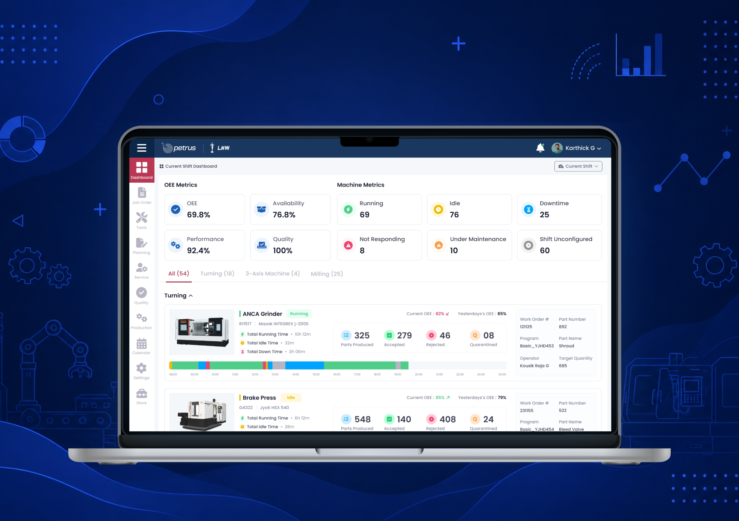
Petrus operates in a data-intensive manufacturing environment where operators and supervisors rely on real-time machine information to maintain production efficiency. We partnered with the team to redesign the dashboard experience, transforming complex telemetry into clear, actionable insights that support faster decisions on the shop floor.
Factory technicians and operators deal with dozens of live gauges, thermal sensors, and high-voltage grid readings simultaneously. The original Petrus interface looked like a legacy Excel spreadsheet—bright white, visually exhausting, and prone to alert fatigue. When anomalies occurred, engineers struggled to pinpoint the failure point in real-time, resulting in expensive energy waste.
Prioritized information:
The most important machine status and alerts appear first.
Clear visual hierarchy:
Exceptions, anomalies, and downtime are highlighted immediately.
Simplified interactions:
Navigation and monitoring were streamlined for faster response during high-pressure situations.
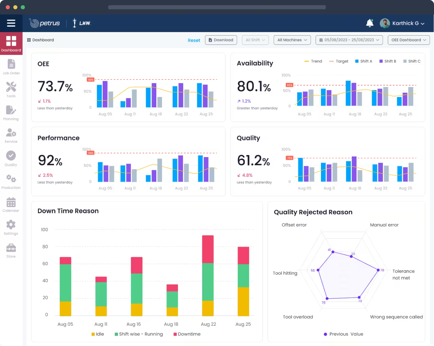
Petrus transforms dense industrial telemetry into visual intelligence. The interface was built for operators who can't afford to misread data — every pixel serves a purpose, from micro-indicators to full-screen anomaly overlays.
Information Prioritization
The most critical machine metrics are surfaced first, reducing time spent searching through complex datasets.
Contextual Drill-Downs
Operators can move seamlessly from high-level summaries to detailed machine insights when deeper investigation is needed.
Visual Performance Indicators
Machine health, production trends, and operational status are communicated through intuitive visual patterns instead of dense tables.
Decision-Focused Dashboard Layout
Every screen is structured to help users identify issues quickly and take action with confidence.


OUTCOMES
The result is a dashboard experience that feels calm, readable, and dependable, even in a highly data-heavy environment.
35%
Issue Detection
Faster issue identification and response to machine anomalies
25%
Cognitive Load
Reduction in operator cognitive load during monitoring tasks
30%
Decision Speed
Improvement in supervisor decision-making speed
Industrial systems do not need more data—they need better experiences. By humanising complex machine information and designing around real workflows, we helped Petrus move from data overload to decision clarity.
ACG
Next Project